Timechart
Time-series line chart for data over time
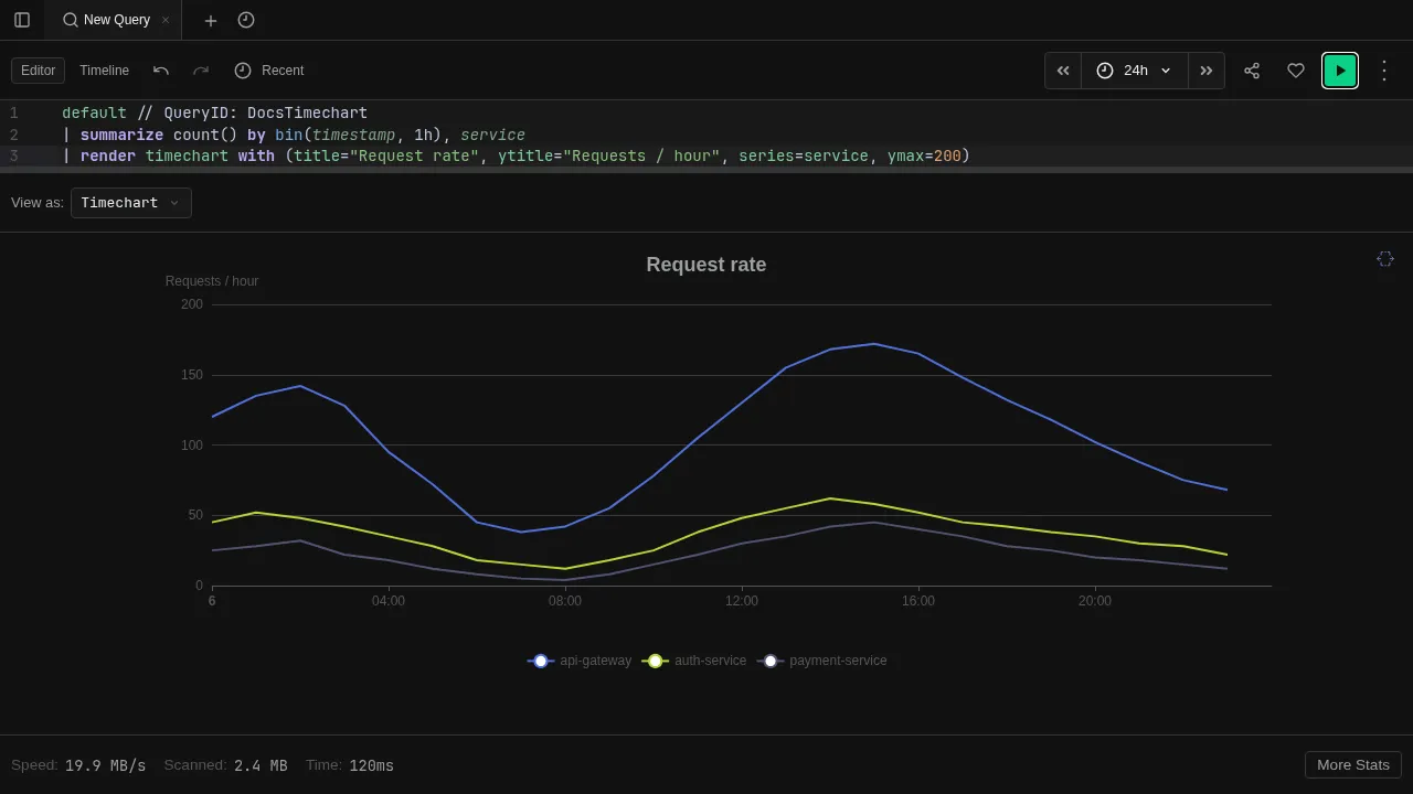
The Timechart view renders results as a line chart with time on the x-axis. Best for visualizing trends, rates, and patterns over time.
Try it
datatable(timestamp:datetime, value:long, series:string) [
  datetime(2024-01-01 00:00), 10, "cpu",
  datetime(2024-01-01 01:00), 15, "cpu",
  datetime(2024-01-01 02:00), 12, "cpu",
  datetime(2024-01-01 03:00), 18, "cpu",
  datetime(2024-01-01 00:00), 50, "memory",
  datetime(2024-01-01 01:00), 55, "memory",
  datetime(2024-01-01 02:00), 48, "memory",
  datetime(2024-01-01 03:00), 60, "memory"
]
| render timechart
Column mapping
When no explicit xcolumn, ycolumns, or series properties are provided via render ... with (...), the timechart automatically detects column roles:
- X-axis — the first
datetimecolumn - Y-axis — all
int,long, orrealcolumns (excluding the x-axis column) - Series split — if there is exactly one remaining column (typically a
stringgroup-by column), each distinct value becomes a separate line
This means summarize count() by bin(timestamp, 5m), service_name produces one line per service automatically — the datetime column is the x-axis, the count is the y-axis, and the service name splits the series.
For make-series results, the timechart detects array-valued columns (datetime arrays for the x-axis, numeric arrays for the y-axis) and renders each row as a separate series.
Use | render timechart with (xcolumn="...", series="...") to override the defaults. See Visualizations for all render properties.
Features
- Multiple series — each distinct value in the series column becomes a separate line
- Interactive legend — click legend entries to show/hide individual series
- Tooltips — hover over data points to see exact values
- Auto-render — use
| render timechartto switch to this view automatically